Mysgardia

Forum
Last Post
Threads / Messages

tahbikat

Member
Member
Joined
Feb 11, 2014
Messages
408
Points
16
Age
30
Location
Louisiana
Mysidian Dollar
32,360
Hi guys!

Okay, so, Mysgardia will be my official actual site. :p The Garden was pretty much a little tester site for me. It's going to stay up until I switch to Mysidia v1.4. After that there will just be Mysgardia! I've purchased the domain mysgardia.com. I may or may not put up a landing page in the meantime.

Anywho, while I'm waiting for 1.4 to come out, I figured I may as well start getting the logo, graphics, etc together to have it all ready. I'll post anything I get finished here. If you guys have any advice, tips, or pointers for my art (or whatever I post) please do comment!

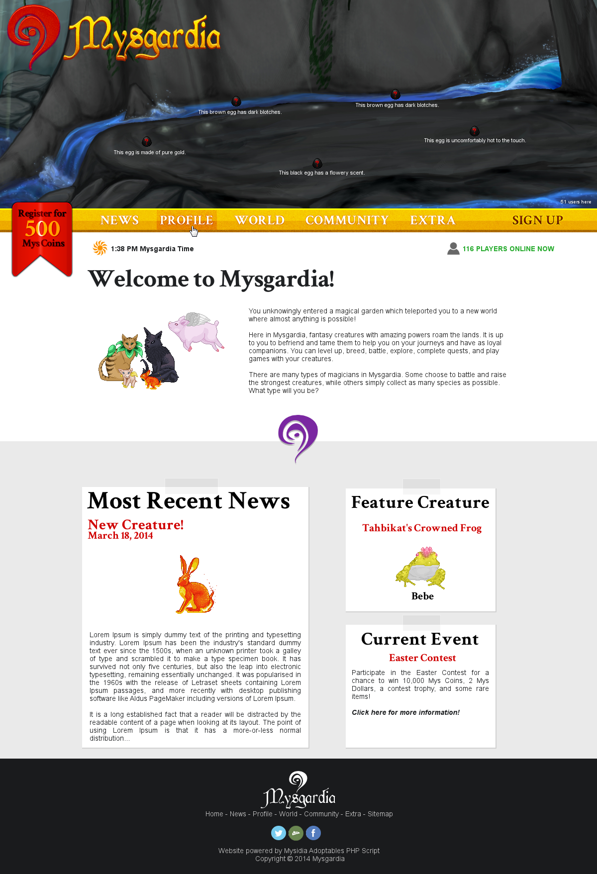
Today I worked on the logo. Here it is:

1d6P3vl.png

detailed_mysgardia_logo_by_tahbikat-d7aolw1.png


The idea for the logo was to have kind of like a simple Celtic sort of text. I used the text Cardinal Alt. For the logo icon I also wanted something to represent magic and a portal aspect. Hopefully I got that okay. :)

I'm not sure what color scheme to use for the logo. I was thinking purple to represent magic and green to represent the "garden" or nature part of it. Hmm...

Next up I'll be posting a mockup of what I'd like the site to eventually look like! For starters I'd like eggs to display on some sort of landscape background, right on the homepage of the site. I'll need some awesome coders to do that most likely. ^^ Check back for the mockup soon!
 
Last edited:
Thanks Hof! <3 one of the members here (squiggler I think?) suggested the name. I think it's a great homage to the Mysidia script too! :smile:

I'll probably post more mockups soon of other site pages like the profile view, adoptables page, etc! :)
 
Nice! The layout's looking beautiful so far. You're presenting stuff in such a way that it looks like it's been taped in place.

I'd love to see some lightweight images added, make the tape more realistic maybe, perhaps even given the announcements the illusion of being on paper. But to make the announcements, which could be a variety of lengths, hold the illusion of being on paper would come with it's own set of difficulties. (Corner textures, repeating side textures...) It might look good, but it might also be a fruitless effort. If it were my site, I might attempt it when I had time... and I still might decide I didn't like it. Best of luck, if that's the route you already had in mind.
 
Thanks Kyttias!

I was actually thinking about putting many more textures and such in that area. Instead of the light grey background it could have a wooden desk texture. The large news post would have a newspaper texture and font, and the sections on the side could have notebook paper textures or sticky note textures.

Or the grey bg could be like a post it board texture even with a "frame" at the top and bottom. And instead of tape there'd be pins. Gosh I don't know! I think I like this idea better. :)

Thanks for the feedback! I'll probably post more mockups so I'd love feedback on those as well when they're up. ^^
 
I think the layout is fine as it is. Tweak things as you go, but don't add too many images.
It will run slower on mobile devices, and slower computers.

Simple is always best when it comes to design. You don't want it to be too busy where users don't know what they're doing or where to go next (That's my current problem with the neopets site. Too much going on all at once. It's overwhelming@.@)
 
Thanks Miki, I forgot all about that! I'll try to limit the amount of images I use on the site.

I also don't like cluttered sites. My style is more clean, simple, and flat most of the time. I'll see what I can do to make the site visually appealing but good with load times as well.

Thanks! <3
 
Mmmmm the ancient 'don't use images' rule is from the archaic days of dial-up. Chances are even people's smartphones could handle images that measure up to be (excuse the potential pun) byte-size. While I definitely want to encourage us all here to push towards mobile-ready websites, it is possible to set images to only load on screen widths higher than a certain amount with only a bit of css (check out this article on media queries). That said? We're building sites centered around adoptables. Images. Sometimes large, colorful, animated, or transparent images. Heaven forbid all at once, but... you get the idea. We're, by our very nature, an image-heavy existence.

If you're already going to have icecream, what's some chocolate drizzled on top really going to do? In fact, if you walk into a restaurant and ordered icecream for dessert, you might even expect that kind of service, whip cream and a cherry, too. Your visitors are already at your door - dazzle them! But with class and finesse, of course. Less is still sometimes more, but as they say about food... people will always attempt to eat a dish that looks well prepared, even if one that isn't beautifully plated actually tastes better. Just make sure your layout/template asset images are nice and compressed, and the use of images sparingly won't hurt.

As another unique tip on top of queries for the size of the device, you could also use a sprite sheet, sliced up nicely with pure css, so only one image has to load. If you're worried about the ping time that multiple small images could take, just make one big sheet and read up on the technique, or use a helpful tool (like this one). Seriously, it's worth looking into! Then all you're doing is positioning a div (or other page element, like a span, or some have suggested to even use italic tags with nothing inside - they think they're being cute, now the i tag sort of stands for icon *laugh*), and equipping it with a class name that will pull the exact image from the exact x and y coordinates located on the sheet with, at the exact height and width it's meant to be in.

If you really want to go for the flatter, fast food frozen yogurt in a simple cone look, because there's nothing wrong with giving people just what they need, just make sure it carries over well to every element of your site. Use few colors, simple and precise wording, and try to create the best environment that showcases an atmosphere your adoptables take the focus in. Flat is good. Flat is in. But any plot line or environments to wander in may start to feel more like bulky flavor text, rather than something equally important, so I worry about over-simplifying things while attempting to carry a flatter design over the entire site in a broad, matching sweep.

The best site is probably a hybrid. Neither too flat nor too glamorous, even and well spread. The taste of luxury casino food, the affordability of fast food, but the welcoming friendliness of the local corner diner. Design and food, definitely great comparisons.

Inevitably, I really do trust your judgement! What you have so far is great! <3
 
Last edited:
Kyttias, are you a blogger or article writer?
Because you should be if not, seriously! If you have a blog you should totally give me the link. I love your writing! <3

Haha, but anyways. I have been mulling it over in my head a lot. Basically what I want is a site that isn't cluttered like so many others. Easy to navigate, find links, find information, etc. BUT, I also know adoptable (and any game, really) sites really do need lots of pretty graphics and images so they're not boring (you already covered this). My end goal is to have something very balanced.

I may do a few more different mockups I had in mind and post them here for you guys to review. I would be very grateful. <3 With the homepage, I'm not sure whether I want more information about the site displayed there or not. Is the news & feature creature section really necessary considering that same information will be displayed on the News page? I don't think so. :p

I think what would be better is to display a small list of popular features the site has, to show visitors and potential members what the site offers. Anyways, I'll probably make some more mockups like I said. It's better to have many options to choose from!
 
Kyttias, are you a blogger or article writer?
Because you should be if not, seriously! If you have a blog you should totally give me the link. I love your writing! <3
I'm not, currently! I'm highly considering it. I do post links to cool web design/development resources on my twitter, tumblr and google+ pages (all not too hard to find with a quick google search, same user name as here!) . . . but I don't write articles just yet. I'm pretty verbose when it comes discussing things I'm passionate about, and I love being helpful.

Also, hmmm... news articles. For returning users, they might like a quick glance at the news the moment they show up at the site -- but new visitors aren't so interested, I agree. I think this could easily be solved be redirecting users at log in straight to the news page. (By default Mysidia redirects to a list of account management features, but... I personally don't like that. In fact, it might be nice to roll the account management list into a widget beside the news, but also making sure that users visiting the news page won't see that widget when they're not logged in.)
 
That's a great idea! I'll do that! :D I too was thinking of putting a little account widget somewhere, just so that members can easily see if they have a new PM and access their basic stats. Eventually I'd really like there to be user experience and levels which can display in the sidebar widget.

But yea seriously, if you ever start up a blog or something let me know, haha. <3
 
Oh the site looks gorgeous. ^^ You are great at designing site template, no question about it. Perhaps you may consider making a few skins/themes for the script? Its your choice though.
 
I was actually thinking about it once I get more familiar with the script. :) if I manage to get one of these layouts installed easily I'll definitely make some free ones for users! c:

Here's the redone brown Flower Cat and a new siamese Flower Cat. c:
Qe2g3SG.png
 
Last edited:
Hmm...the second one- if the black part can collapse, you'd probably want to do that. With the recent emphasis on smaller screens, computers aren't as wide as they used to be.
I think a good compromise is what UC does. It has a thin sidebar with space on both sides to compensate for smaller screens. (Note: The sidebar is about 2/3x as long if you're logged in.)
 
This might help on making the sidebar work well on smaller screens (even phones): http://liveweave.com/KmNVd7 I tried to simplify the code as much as possible. Check out what it does at different widths! At anything above a certain size, the menu toggle won't appear at all. At smaller widths, the menu can be collapsed with it. How you manage your space vertically within the sidebar is up to you.

With that in mind, it'd be easy to change the height of any header you included to be shorter on mobile devices. I've colored the space for the header and wrote a note by it in the css. If you make a copy of it in the section for smaller screen widths, and change the height, then you'll be able to have something mobile-friendly. ^^
 
Last edited:
Honestly, I wonder if the MAS could do with a more collaborative effort...I know HallofFamer loves doing what he does with Mysidia, and I know at least a couple others are working on it (or have in the past), but I do wonder what could happen if it was hosted on something like GitHub or something. It would also be pretty easy for people to modify code and then have pull requests for HoF to check through and such.

Back on topic, you are pretty epic with designs, tahbikat! I hope mine can look half as nice as yours! I've just got a lot of overhead at the moment kuz I tend to go a little too big for what I want/really need X3
 
Thanks a lot Zyraph! ^^ That means a lot!
And as long as you have the dedication and inspiration, I'm sure your site will be amazing! :)
 
Similar threads
Thread starter Title Forum Replies Date
tahbikat Mysgardia 2.0 Adoptables Buzz 33

Similar threads

Users who are viewing this thread

  • Forum Contains New Posts
  • Forum Contains No New Posts

Forum statistics

Threads
4,277
Messages
33,122
Members
1,602
Latest member
BerrieMilk
BETA

Latest Threads

Latest Posts

Top