Tequila The Grim One Staff member Dev Staff Joined Jan 21, 2009 Messages 1,312 Points 0 Location Souther Tier, New York State Mysidian Dollar 68,306 Jan 23, 2011 #21 SpOoky Preview Good night... Attachments muwhahaha.jpg 20.8 KB · Views: 39
F fadillzzz Dev Staff Staff member Dev Staff Joined Jan 20, 2010 Messages 499 Points 0 Mysidian Dollar 25,250 Jan 23, 2011 #22 Hey, that's not spooky! That's Awesome!! I love how the banner matches the layout When are you going to release it?
Hey, that's not spooky! That's Awesome!! I love how the banner matches the layout When are you going to release it?
Tequila The Grim One Staff member Dev Staff Joined Jan 21, 2009 Messages 1,312 Points 0 Location Souther Tier, New York State Mysidian Dollar 68,306 Jan 24, 2011 #23 fadillzzz said: Hey, that's not spooky! That's Awesome!! I love how the banner matches the layout When are you going to release it? Click to expand... Soon, I haven't gotten the background done yet, and will hopefully have it soon.
fadillzzz said: Hey, that's not spooky! That's Awesome!! I love how the banner matches the layout When are you going to release it? Click to expand... Soon, I haven't gotten the background done yet, and will hopefully have it soon.
C ChibiMaestro bruh Premium Member Joined Nov 7, 2010 Messages 298 Points 0 Age 26 Location United Kingdom Mysidian Dollar 19,277 Jan 25, 2011 #24 The northern lights... looks.... so... beautiful and is really affective towards the dark theme :3
Tequila The Grim One Staff member Dev Staff Joined Jan 21, 2009 Messages 1,312 Points 0 Location Souther Tier, New York State Mysidian Dollar 68,306 Jan 25, 2011 #25 All right, final preview is active, please visit: http://design.sessions-st.net/preview/spooky/example.html
All right, final preview is active, please visit: http://design.sessions-st.net/preview/spooky/example.html
Hall of Famer Administrator Staff member Administrator Joined Dec 15, 2008 Messages 4,564 Points 48 Location United States Mysidian Dollar 214,223 Jan 25, 2011 #26 This looks amazing Enddayne, its rather impressive that you completed it on your birthday. ^^
Tequila The Grim One Staff member Dev Staff Joined Jan 21, 2009 Messages 1,312 Points 0 Location Souther Tier, New York State Mysidian Dollar 68,306 Jan 25, 2011 #27 I wouldn't say complete yet... http://end-day.net/devdemo It's breaking, it's breaking... *wicked witch dying sounds*
I wouldn't say complete yet... http://end-day.net/devdemo It's breaking, it's breaking... *wicked witch dying sounds*
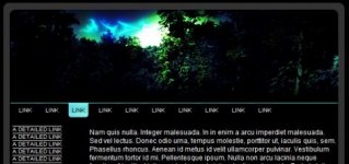
Tequila The Grim One Staff member Dev Staff Joined Jan 21, 2009 Messages 1,312 Points 0 Location Souther Tier, New York State Mysidian Dollar 68,306 Jan 26, 2011 #28 So redoing the SpOooky theme.. This is a preview of the layout at 55% zoom out.
RoconzaArt Member Member Joined Jan 9, 2011 Messages 479 Points 0 Location NJ Shore (and proud of it) Mysidian Dollar 25,728 Jan 26, 2011 #29 I like were this is going
Tequila The Grim One Staff member Dev Staff Joined Jan 21, 2009 Messages 1,312 Points 0 Location Souther Tier, New York State Mysidian Dollar 68,306 Jan 26, 2011 #30 So, let's preview the new version... http://end-day.net/devdemo/spooky/example.html
Tequila The Grim One Staff member Dev Staff Joined Jan 21, 2009 Messages 1,312 Points 0 Location Souther Tier, New York State Mysidian Dollar 68,306 Jan 27, 2011 #31 It's done, please let me know what you think: http://end-day.net/devdemo/index.php
RoconzaArt Member Member Joined Jan 9, 2011 Messages 479 Points 0 Location NJ Shore (and proud of it) Mysidian Dollar 25,728 Jan 27, 2011 #32 I love it In my opinion the content page could be a little wider. It feels awkward with page being so small and all that open space on the right side of the screen. Feel like it would not hurt to have some more space. Just a suggestion: http://i1134.photobucket.com/albums/m605/LordMacguffin/228c723f.jpg It's easier on the eyes
I love it In my opinion the content page could be a little wider. It feels awkward with page being so small and all that open space on the right side of the screen. Feel like it would not hurt to have some more space. Just a suggestion: http://i1134.photobucket.com/albums/m605/LordMacguffin/228c723f.jpg It's easier on the eyes
Tequila The Grim One Staff member Dev Staff Joined Jan 21, 2009 Messages 1,312 Points 0 Location Souther Tier, New York State Mysidian Dollar 68,306 Jan 28, 2011 #33 Hm, let me see. I'll set it to auto and then take a look.
Tequila The Grim One Staff member Dev Staff Joined Jan 21, 2009 Messages 1,312 Points 0 Location Souther Tier, New York State Mysidian Dollar 68,306 Jan 28, 2011 #34 It's set at 75% so it will shift with the browser size. Nix that, it's stationary.
Hall of Famer Administrator Staff member Administrator Joined Dec 15, 2008 Messages 4,564 Points 48 Location United States Mysidian Dollar 214,223 Jan 28, 2011 #35 This looks really great Enddayne, you are making better and better styles. ^^
RoconzaArt Member Member Joined Jan 9, 2011 Messages 479 Points 0 Location NJ Shore (and proud of it) Mysidian Dollar 25,728 Jan 28, 2011 #36 I think it looks much better that way. Good choice on removing the drop shadows they looked kinda weird. Awesome layout.
I think it looks much better that way. Good choice on removing the drop shadows they looked kinda weird. Awesome layout.
Tequila The Grim One Staff member Dev Staff Joined Jan 21, 2009 Messages 1,312 Points 0 Location Souther Tier, New York State Mysidian Dollar 68,306 Jan 28, 2011 #37 Thanks. Did anyone see the changes to adopt.php, doadopt.php, and myadopts.php on the test site?
RoconzaArt Member Member Joined Jan 9, 2011 Messages 479 Points 0 Location NJ Shore (and proud of it) Mysidian Dollar 25,728 Jan 28, 2011 #38 I like what you did with the adopt page.
Tequila The Grim One Staff member Dev Staff Joined Jan 21, 2009 Messages 1,312 Points 0 Location Souther Tier, New York State Mysidian Dollar 68,306 Jan 28, 2011 #39 Thanks, the code for it is up in another thread.

 Forum Contains New Posts
 Forum Contains No New Posts